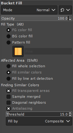
Okay, this is nothing functional and really just something for the eye. I am using Gimp on a regular basis and think it is a really great piece of software. There was just something that annoyed me every time I used the software: The font integration which looked to me somehow “out of place”. Let me give an example:

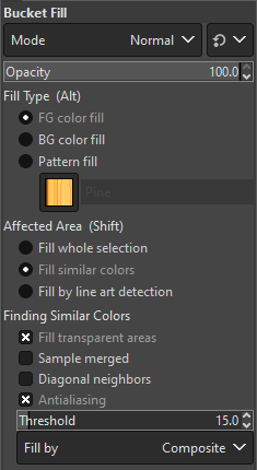
The font here just does not match the default Windows font “Segoe UI” and the scaling is also different. This is how it should look like:

You can clearly see the difference in the font presentation. Good thing is, this can easily be changed in the file “gtkrc” in the theme directory:
%ProgramFiles%\Gimp\share\gimp\2.0\themes\Dark\gtkrcReplace “Dark” with the theme you are using on your system. There are a few of them in this folder.
- Uncomment the line starting with “#gtk-font-name” and change it to:
gtk-font-name = "Segoe UI 9" - Find the line
GimpRuler::font-scale = 0.6444
and change it toGimpRuler::font-scale = 1 - Find the line
GimpDock::font-scale = 0.6444
and change it toGimpDock::font-scale = 1
With these changes Gimp should look like a regular Windows application using the default font.